Women in academic STEM fields
In [6]:
import pandas as pd
import numpy as np
import seaborn as sns
import matplotlib.pyplot as plt
import scipy

%matplotlib inline
Goals of this analysis
There are plenty of studies that detail the discrimination women face in being hired into STEM positions (Science, Technology, Engineering, Mathematics), and also many studies on the gender wage gap between men and women, e.g. here, here and here.
I thought I would use the University of Arizona’s own employee salary data to study these trends via analysing the differences in salaries paid across the university as a function of academic department, job type/level and gender. I focus on departments within STEM fields because I already have domain knowledge of their different sub-fields and academic job hierarchies.
The data set
The University of Arizona’s data set of employee salaries can be found online. I
scraped the data from the past year (2014-2015) using BeautifulSoup into a
pandas dataframe. Presented below is roughly the chunk of code I used to do
that:
link2014 = "https://docs.google.com/spreadsheets/d/1xUWyf0DlM6eJTKsUSJ6MyQjM 6JnmmLSq7x4n5iq43uQ/pubhtml"

### Parse webpage with BeautifulSoup
text = requests.get(link).text
soup = BeautifulSoup(text)


### Find all rows
peopleTags = soup.find_all('tr')

# first row is just for formats -> skip

# second row has column names
header = peopleTags[1].find_all('td')


### Get column names
columns = []
for head in header:
    columns.append(head.get_text())


# list of dictionaries
rows = []
for i in xrange(2,len(peopleTags)):

    personData = peopleTags[i].find_all('td')

    if len(personData)<1:
        print "Found", len(rows), "employees"
        break

    # first grab text out of each tag
    x = []
    for p in personData:
        x.append(p.get_text())

    # create a person dictionary
    person = {}

    # parse name into first and surname
    if len(x[0].split(','))<2:
        print x
        print x[0]
    person['first_names'] = x[0].split(',')[1]
    person['surname'] = x[0].split(',')[0]

    # Primary title
    person[columns[1]] = x[1]

    # Annual salary at full FTE (full time equivalency)
    person[columns[2]] = float(x[2].replace(',', ''))

    # State fund ratio
    person[columns[3]] = float(x[3].replace('%', ''))

    # Department
    person[columns[4]] = x[4]

    # FTE (number between 0 and 1)
    person[columns[5]] = float(x[5])

    # Annual Sal Emplid FTE (just FTE*Annual salary at full FTE)
    person[columns[6]] = float(x[6].replace(',', ''))

    rows.append(person)

### Create pandas dataframe
dbData = pd.DataFrame(rows)


### Save output
outname = "salary2014.csv"
dbData.to_csv(outname)
From the comments in the code above you can see the data set contains:
- employee name
- job title
- annual salary (at full time equivalency)
- percentage of funding from State sources (I think? But I won’t use this anyway)
- department employed by
- FTE (1=full time, fraction indicates part-time)
- actual annual salary (annual salary at full time * FTE)
In total there were approximately 12,000 jobs.
Classing names with a binary gender value
To make the data set more interesting I used a library called SexMachine (eye
roll) to assign a gender given the employee’s first name. The code I used
looked like this:
### Set up gender detector
d = gender.Detector()


### Add gender column to data table
sLength = len(data)
data['gender'] = pd.Series(np.random.randn(sLength), index=data.index)

for i in range(sLength):

    nom = data['first_names'][i].split(' ')[0]

    # check that the 'first' of the first names is not just an initial
    # (some first names are entered e.g. like J Edward)
    # if it is, use the 'second' of the first names to designate gender
    if len(nom)<2:
        print "Person", i+1 ,"of", sLength,
        print "first name is initial", nom ,"taking second name",
        nom = data['first_names'][i].split(' ')[1]
        print nom, "(full name", data['first_names'][i],")"

    sex = d.get_gender(nom)

    if sex=="mostly_female":
        sex = u"female"

    elif sex=="mostly_male":
        sex = u"male"

    elif sex=="andy":
        sex = "unknown"

    data.loc[i,['gender']] = sex
Where I simply assigned a name as female if the output was mostly_female,
e.g. as might be returned if the supplied name was “Erin”, and similarly for
mostly_male. The “SexMachine” mostly failed (sex=unknown) on names of
Chinese or Indian origin. This could definitely cause some bias in the results
presented below if there is an over-representation of e.g. males with Chinese or
Indian origin names (e.g. in STEM)
To estimate the approximate error rate for the employees who did get classed with a gender, I first estimated the sample size required to provide a 95% confidence level for a margin of error of 1% in the error rate:
where I assumed the standard deviation for the error rate \(\sigma\), which can take values between 0 (no wrong classifications) and 1 (all classifications wrong), as being 0.5 to make sure the sample size would be over- rather than under-estimated. For a random sample of this size I manually checked the classifications and found that the error rate is about 2%.
This approach is obviously an over-simplification and problematic as it relies on the assumption that a person with a likely “female” or “male” sounding name would identify themselves with that same binary category. The categories “female” or “male” should be interpreted as the employee’s most likely binary gender choice, rather than a strict categorisation of the employees’ gender.
Data cleaning (90% of the time was spent here!)
Looking at the data, there are 375 unique “Department” names and 3705 unique “Primary Title”’s (i.e. job titles). Given the size of this data set (12,000 entries) I needed to aggregate together similar departments and similar job titles to study the variation of salaries in the university.
I added four more columns to the dataframe: “Academic?”, “STEM?”, “Department type”, and “Job group”.
The “Academic?” column is a True or False value depending on whether the
department is academic or not (e.g. non-academic being things like the
University Police department or Facilities Management)
The “STEM?” column is a True or False value depending on whether the
department is in a “Science”, “Technology”, “Engineering” or “Mathematics”
field. Therefore all "Academic?==False departments will be "STEM?==False
too.
“Department type” is a broader name for the type of department, e.g. for
"Academic?==True this could be one of: ‘Humanities’, ‘Professional’, ‘Social
Sciences’, ‘Natural Sciences’, ‘Formal Sciences’. Departments classed as ‘Social
Sciences’ could be either STEM (e.g. Psychology) or non-STEM (e.g. Sociology),
and departments classed as ‘Professional’ could be either STEM (e.g. Civil
Engineering, Medical imaging) or non-STEM (e.g. Accounting, Medcine, Law).
Aggregating “Primary Title” into different “Job group” was not as comprehensive, and just focussed on classifying “Primary title”’s into one of the following groups: student, postdoc, engineer, assistant scientist, associate scientist, senior scientist, assistant professor, associate professor, professor. Everything else was just classed as “other”.
The data!
In [7]:
### Read in file
filename = 'salary2014_with_gender_valueadded.csv'
data = pd.read_csv(filename)


### Drop unneccessary columns
data.drop([u'Unnamed: 0', u'Unnamed: 0.1', u'Unnamed: 0.1'], axis=1, inplace=True)
columns = data.columns


print "Data snippet:"
print data.head(5)
Data snippet:
Annual Sal Emplid FTE Annual Salary at Full FTE \
0 58067.0 58067.0
1 37844.0 37844.0
2 35000.0 35000.0
3 40000.0 40000.0
4 53000.0 53000.0
Department FTE Primary Title \
0 Dept of Emergency Medicine 1.0 Manager, Residency Program
1 University Police Department 1.0 Police Evidence/Property Tech
2 Radiation Oncology 1.0 Administrative Associate
3 Africana Studies 1.0 Lecturer, Africana Studies
4 Physics 1.0 Assistant Research Scientist, Physics
State Fund Ratio first_names surname gender Academic? STEM? \
0 0.0 ******** ***** female True False
1 100.0 ******** ***** male False False
2 40.0 ******** ***** female True False
3 100.0 ******** ***** unknown True False
4 0.0 ******** ***** female True True
Department type Job group
0 Professional other
1 Infrastructure other
2 Professional other
3 Social Sciences lecturer
4 Natural Sciences assistant scientist
Across the entire university
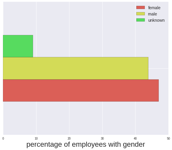
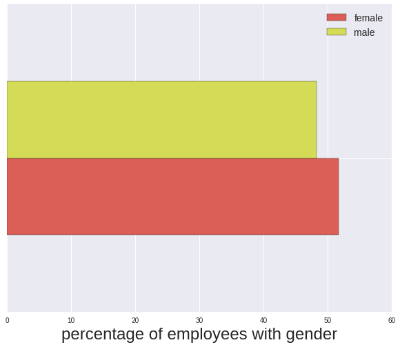
To get the highest level picture first I plot the percentage of employees of each gender. 9% of employees were not assigned a gender, and from here on I will remove them from further analysis. As discussed above this could cause some bias in the following results.
From other sources I found the percentage of women of working age in the United States:
- female 51.7%
- male 48.3%
I can now calculate significance between the difference in proportions of female and male employees at the University of Arizona, compared to the pool of working age female and males in the USA.
The standard error of the difference between the estimated proportions of population 1 (\(\hat{p}_1\)) and population 2 (\(\hat{p}_2\)) is:
i.e. \(\hat{p}_1\) and \(\hat{p}_2\) are the population proportions estimated from the University of Arizona data, and \(n_1\) and \(n_2\) are the respective sample sizes. The p-value for the difference in these populations is calculated from the z-score:
where \(p_1\) and \(p_2\) are the actual population proportions, i.e. those found from the Department of Labor’s statistics on the percentage of women of working age in the USA.
The calculation below shows that the null hypthesis (that there is no difference between the UA’s male/female proportion compared to that of working age people in the USA) cannot be rejected at a signficiant confidence level. This means the female to male population of employees at the University of Arizona reasonably reflects that of the working age population in the USA.
In [8]:
def std_error_pop_proportion(p1, p2, n1, n2):
    """Return the standard error of the difference in sample population proportions

       @param p1    proportion of population 1 (e.g. 0.51 female)
       @param p2    proportion of population 2 (e.g. 0.49 male)
       @param n1    sample size of population 1 (e.g. 1004)
       @param n2    sample size of population 2 (e.g. 965)

    See p. 6 onwards:
    http://www.udel.edu/FREC/ilvento/FREC408/class27.pdf
    """
    term1 = p1*(1.-p1)/n1
    term2 = p2*(1.-p2)/n2
    return np.sqrt(term1+term2)


def pvalue_pop_proportion(p1, p2, p1pop, p2pop, stderr):
    """Return the p value of the difference in population proportions given the null hypothesis:
       H0 = p1pop-p2pop. If the null hypothesis is that the proportions are equal, p1pop-p2pop=0 and
       the one tail test should be performed, else |p1pop-p2pop|>0 and the two tail test should be
       performed.

       @param p1       proportion of population 1 (e.g. 0.58 female)
       @param p2       proportion of population 2 (e.g. 0.42 male)
       @param p1pop    hypothesis of proportion of population 1 (e.g. 0.51 female)
       @param p2pop    hypothesis of proportion proportion of population 2 (e.g. 0.49 male)
       @param stderr   standard error of the difference in sample population proportions
    """
    z = ((p1-p2) - (p1pop-p2pop))/stderr

    if abs(p1pop-p2pop)>0:
        p_value = scipy.stats.norm.sf(abs(z)) # one-sided
    else:
        p_value = scipy.stats.norm.sf(abs(z))*2. # two-sided

    return p_value


data_counts = data['gender'].value_counts()

### Plot rate of employment by gender (including unknown)
fig = plt.figure(figsize=(10,8))
ax = fig.add_subplot(111)
data_percentage = 100.*data_counts/data_counts.sum()
pd.DataFrame(data_percentage).transpose().plot(kind='barh', stacked=False,
             color=sns.color_palette('hls'), ax=ax)
ax.legend(prop={'size':14})
ax.set_xlabel('percentage of employees with gender', fontsize=24)
ax.set_ylabel('')
plt.setp(ax, yticklabels="")


print "Percentage of each gender (including unknown)"
print data_percentage, "\n"


# For selecting only entries where the gender is known
iknown = data["gender"].isin(["male","female"])

data_counts = data['gender'][iknown].value_counts()
nf = data_counts[0]
nm = data_counts[1]
pfemale = nf/float(nf+nm)
pmale = nm/float(nf+nm)


### Plot rate of employment by gender (not including unknown)
fig = plt.figure(figsize=(10,8))
ax = fig.add_subplot(111)
data_percentage = 100.*data_counts/data_counts.sum()
pd.DataFrame(data_percentage).transpose().plot(kind='barh', stacked=False,
             color=sns.color_palette('hls'), ax=ax)
ax.legend(prop={'size':14})
ax.set_xlabel('percentage of employees with gender', fontsize=24)
ax.set_ylabel('')
plt.setp(ax, yticklabels="")

print "Percentage of each gender (excluding unknown)"
print data_percentage, "\n"


### Difference in population proportions analysis
# From the US census
p_female_us_workingage = 0.517
p_male_us_workingage = 0.483

# calculate standard error
std_err = std_error_pop_proportion(pfemale, pmale, nf, nm)

# calculate p values
us_result = pvalue_pop_proportion(pfemale, pmale, p_female_us_workingage,
                                                  p_male_us_workingage, std_err)
result_string = "The null hypothesis that the UA female/male population "
result_string += "proportion difference of {0:.5f}\n"
result_string += "is not different from the USA female/male population "
result_string += "proportion difference of {1:.5f}\n"
result_string += "is rejected at (1-p)={2:.3f}"

print result_string.format(abs(p_female_us_workingage-p_male_us_workingage),
                           abs(pfemale-pmale), 1.-us_result)
Percentage of each gender (including unknown)
female 47.033757
male 43.908757
unknown 9.057487
Name: gender, dtype: float64
Percentage of each gender (excluding unknown)
female 51.718118
male 48.281882
Name: gender, dtype: float64
The null hypothesis that the UA female/male population proportion difference of 0.03400
is not different from the USA female/male population proportion difference of 0.03436
is rejected at (1-p)=0.515
For earnings I examine the “Annual Salary at Full FTE” because even if an individual position is part-time, this is its equivalent full time annual salary. Therefore, no matter the actual hours worked per position I am comparing the same equivalent salaries.
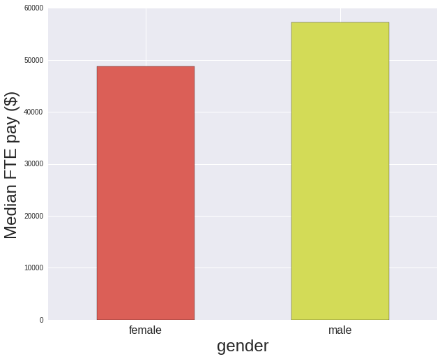
In terms of women’s earnings overall across the university, as compared to the the ratio of women’s to men’s earnings in 2015 of 81.8% found in Institute for Women’s Policy Research’s report on Status of Women in the States, women at the University of Arizona are doing a little better with a 85.3% ratio.
In [9]:
### Plot median salary by gender
grouped_by_gender = data[iknown].groupby(["gender"])["Annual Salary at Full FTE"].median()

fig = plt.figure(figsize=(10,8))
ax = fig.add_subplot(111)
grouped_by_gender.plot(kind='bar', stacked=True, ax=ax, color=sns.color_palette('hls'))
plt.xticks( rotation='horizontal', fontsize=16)
ax.set_xlabel("gender", fontsize=24)
ax.set_ylabel("Median FTE pay ($)", fontsize=24)

ratio = 100*grouped_by_gender[0]/grouped_by_gender[1]
print "Ratio of women's to men's earnings: {0:.3f}%".format(ratio)
Ratio of women's to men's earnings: 85.344%
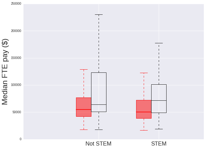
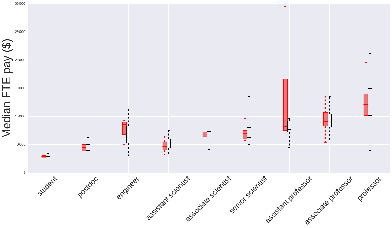
It’s more instructive to see the distribution of salaries by gender, so for this I use a box plot. The line across the middle of the box indicates the median salary. The box itself defines where the central 25% to 75% of the data lie (the interquartile range), and the caps at the end indicate the entire range of the data.
In [10]:
def color_boxes(numBoxes, bp, ax, color):
    """
       @param numBoxes    total number of boxes in boxplot (with handle bp on axes ax)
       @param bp          handle of boxplot
       @param ax          axes handle
    """

    from matplotlib.patches import Polygon
    medians = list(range(numBoxes))
    for i in range(numBoxes):

        # box in question
        box = bp['Annual Salary at Full FTE']['boxes'][i]
        boxX = []
        boxY = []
        for j in range(5):
            boxX.append(box.get_xdata()[j])
            boxY.append(box.get_ydata()[j])
        boxCoords = list(zip(boxX, boxY))

        boxPolygon = Polygon(boxCoords, facecolor=color, alpha=0.5)
        ax.add_patch(boxPolygon)

        # Now draw the median lines back over what we just filled in
        med = bp['Annual Salary at Full FTE']['medians'][i]
        medianX = []
        medianY = []
        for j in range(2):
            medianX.append(med.get_xdata()[j])
            medianY.append(med.get_ydata()[j])
            plt.plot(medianX, medianY, color)
            medians[i] = medianY[0]


def outline_boxes_with_color(bp, color):
    """Change all lines on boxplot, the box outline, the median line, the whiskers and
       the caps on the ends to be 'color'

       @param bp       handle of boxplot
       @param color    color to change lines to
    """

    plt.setp(bp['Annual Salary at Full FTE']['boxes'], color=color)
    plt.setp(bp['Annual Salary at Full FTE']['whiskers'], color=color)
    plt.setp(bp['Annual Salary at Full FTE']['medians'], color=color)
    plt.setp(bp['Annual Salary at Full FTE']['caps'], color=color)


### Plot salary distribution by gender
boxwidth = 0.25

# take only known gender entries
data_gender_known = data[ (data["gender"].isin(["female","male"])) ]

fig = plt.figure(figsize=(10,8))
ax = fig.add_subplot(111)

bp = data_gender_known.boxplot(column=["Annual Salary at Full FTE"], return_type='dict',
                         by="gender", ax=ax, widths=boxwidth)
outline_boxes_with_color(bp, 'black')
numBoxes = 1
color_boxes(numBoxes, bp, ax, "red")
ax.set_xlabel('', fontsize=24)
ax.set_ylabel('Median FTE pay ($)', fontsize=24)
ax.set_title('')
ax.set_ylim([0,200000])
plt.xticks(rotation='horizontal', fontsize=18)
fig.suptitle('')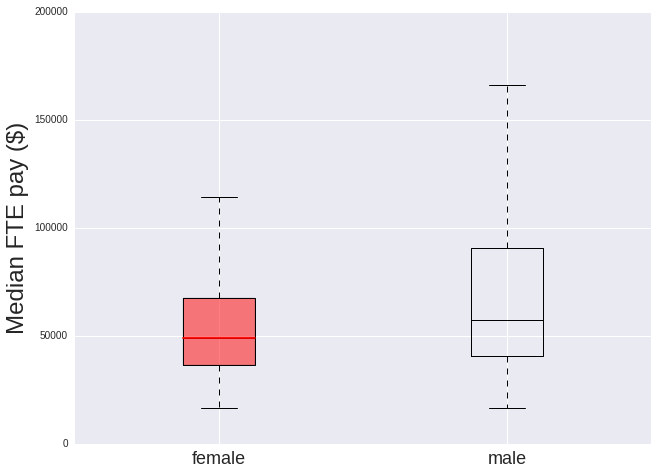
Comparing STEM and non-STEM departments
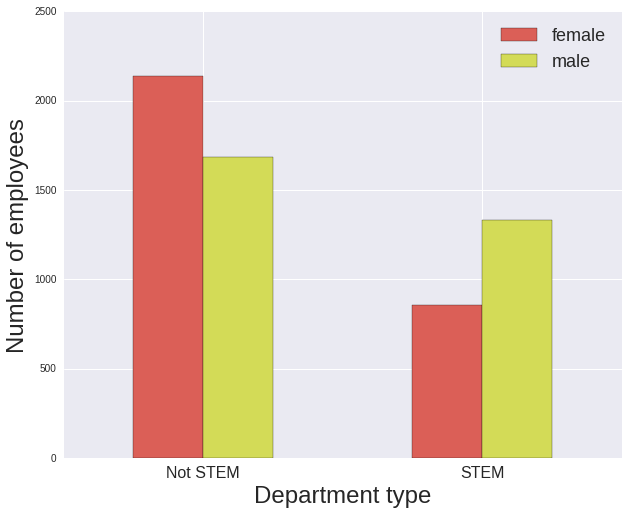
There are a greater number of women than men in the non-STEM departments, and there are fewer women than men in the STEM departments. Note that at this stage all jobs within a particular department are considered (e.g. potentially administrative, accounting, facilities maintenance positions), not just those that are academic in nature.
In both cases men are paid significantly more: with the ratio of women’s to men’s earnings being 70.2% for women in STEM departments (much lower than the 85.3% over the entire university) and 86.0% for women not in STEM (much more in line with the overall university ratio).
Comparing the median salary values, women in STEM are paid less than women not in STEM, however men in STEM are paid more than men not in STEM.
In [11]:
# For selecting only entries where the gender is known and the department type is
# Academic
iknown_ac = (data["gender"].isin(["male","female"])) & (data["Academic?"]==True)


median_salaries = data[iknown_ac].groupby(["STEM?","gender"])[
                  "Annual Salary at Full FTE"].median().unstack(
                  "gender").fillna(0)
print "Median salaries:"
print median_salaries, "\n"

print "Ratio of median salary, female/male:"
print median_salaries["female"]/median_salaries["male"]

grouped_by_gender = data[iknown_ac].groupby(["STEM?","gender"]).size().unstack(
                           "gender").fillna(0)

### Plot rate of employment by gender
fig = plt.figure(figsize=(10,8))
ax = fig.add_subplot(111)
grouped_by_gender.plot(kind='bar', stacked=False, ax=ax,
                       color=sns.color_palette('hls'))
plt.xticks( rotation='horizontal', fontsize=16)
ax.legend(prop={'size':18})
ax.set_xlabel("Department type", fontsize=24)
ax.set_ylabel("Number of employees", fontsize=24)
xtickNames = plt.setp(ax, xticklabels=["Not STEM", "STEM"])


### Plot salary distribution by gender
boxwidth = 0.25

# split into female and male to plot separately
data_female = data[(data["gender"]=="female") & (data["Academic?"]==True) ]
data_male = data[(data["gender"]=="male") & (data["Academic?"]==True)  ]

fig = plt.figure(figsize=(10,8))
ax = fig.add_subplot(111)

bp = data_female.boxplot(column=["Annual Salary at Full FTE"], return_type='dict',
                         by="STEM?", ax=ax, widths=boxwidth, positions=[1,2])
numBoxes = 2
color_boxes(numBoxes, bp, ax, 'red')
outline_boxes_with_color(bp, 'red')

bp = data_male.boxplot(column=["Annual Salary at Full FTE"], return_type='dict',
                         by="STEM?", ax=ax, widths=boxwidth, positions=[1.25,2.25])
outline_boxes_with_color(bp, 'black')
ax.set_xlabel('', fontsize=24)
ax.set_ylabel('Median FTE pay ($)', fontsize=24)
ax.set_title('')
ax.set_xlim([0,3])
ax.set_ylim([0,250000])
plt.xticks(rotation='horizontal', fontsize=18)
xtickNames = plt.setp(ax, xticklabels=["Not STEM", "STEM"])
fig.suptitle('')
Median salaries:
gender female male
STEM?
False 55029.0 64000.0
True 50112.0 71414.0
Ratio of median salary, female/male:
STEM?
False 0.859828
True 0.701711
dtype: float64
Comparing different department types within STEM
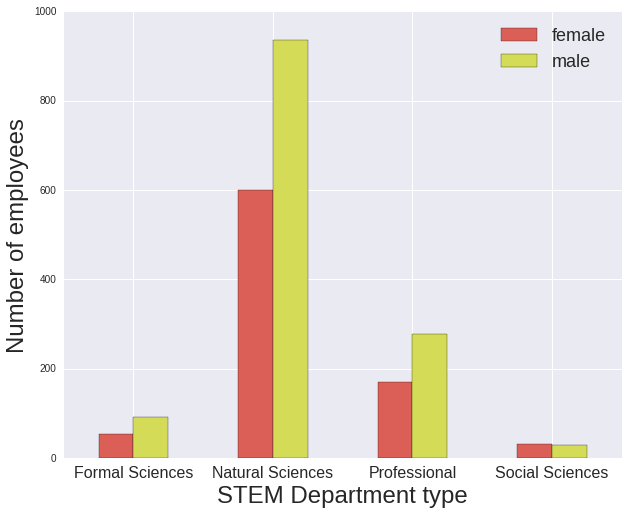
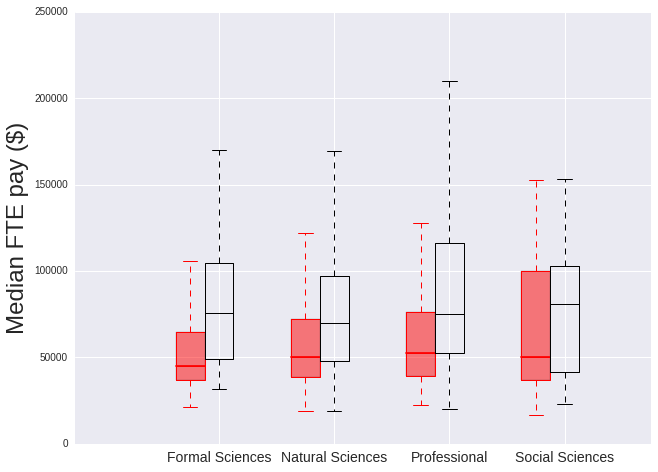
Here are the rough defintions of the STEM deparment types:
- Professional: Biomedical, Engineering, Medical Imaging, Neuroscience, Ophthalmology, Pharmacology
- Social Sciences: Psychology
- Natural Sciences: Astronomy, Atmospheric Sciences, Chemistry, Ecology, Environmental Sciences, Geosciences, Optical Sciences, Physics, Plant Sciences
- Formal Sciences: Applied Mathematics, Computer Sciences, Informatics, Mathematics
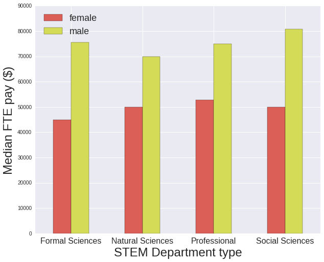
The salaries of women in the Formal Sciences and Social Sciences (Psychology) are signficantly lower than men’s with their ratio of median salary female/male being around 60%, whereas for Professional and Natural Sciences it is around 70%. However there is a low number of employees within the Formal Sciences and Social Sciences groups, with much few individual departments included in their types, so it’s difficult to draw any conclusions.
In [12]:
# For selecting only entries where the gender is known, the department type is Academic
# and STEM
iknown_ac_stem = (data["gender"].isin(["male","female"])) & (data["Academic?"]==True) & \
                 (data["STEM?"]==True)


# for data set with known gender where Academic=True and STEM=True,
# group by department type and gender
grouped_by_gender = data[iknown_ac_stem].groupby(["Department type","gender"]).size() \
                    .unstack("gender").fillna(0)

print "Number of employees:"
print grouped_by_gender, "\n"

### Plot rate of employment by gender
fig = plt.figure(figsize=(10,8))
ax = fig.add_subplot(111)
grouped_by_gender.plot(kind='bar', stacked=False, ax=ax, color=sns.color_palette('hls'))
plt.xticks( rotation='horizontal', fontsize=16)
ax.legend(prop={'size':18})
ax.set_xlabel("STEM Department type", fontsize=24)
ax.set_ylabel("Number of employees", fontsize=24)


### Plot median salary by gender
grouped_by_gender = data[iknown_ac_stem].groupby(["Department type","gender"]) \
                        ["Annual Salary at Full FTE"].median().unstack("gender").fillna(0)
print "Ratio of median salary, female/male:"
print grouped_by_gender["female"]/grouped_by_gender["male"]


fig = plt.figure(figsize=(10,8))
ax = fig.add_subplot(111)
grouped_by_gender.plot(kind='bar', stacked=False, ax=ax, color=sns.color_palette('hls'))
plt.xticks( rotation='horizontal', fontsize=16)
ax.legend(prop={'size':18}, loc='upper left')
ax.set_xlabel("STEM Department type", fontsize=24)
ax.set_ylabel("Median FTE pay ($)", fontsize=24)


### Plot salary distribution by gender
boxwidth = 0.25

# split into female and male to plot separately
data_female = data[(data["gender"]=="female") & (data["Academic?"]==True) & \
                   (data["STEM?"]==True)]
data_male = data[(data["gender"]=="male") & (data["Academic?"]==True)  & \
                 (data["STEM?"]==True) ]

fig = plt.figure(figsize=(10,8))
ax = fig.add_subplot(111)

bp = data_female.boxplot(column=["Annual Salary at Full FTE"], return_type='dict',
                         by="Department type", ax=ax, widths=boxwidth,
                         positions=[1,2,3,4])
numBoxes = 4
color_boxes(numBoxes, bp, ax, 'red')
outline_boxes_with_color(bp, 'red')

bp = data_male.boxplot(column=["Annual Salary at Full FTE"], return_type='dict',
                         by="Department type", ax=ax, widths=boxwidth,
                         positions=[1.25,2.25,3.25,4.25])
outline_boxes_with_color(bp, 'black')
ax.set_xlabel('', fontsize=24)
ax.set_ylabel('Median FTE pay ($)', fontsize=24)
ax.set_title('')
ax.set_xlim([0,5])
ax.set_ylim([0,250000])
plt.xticks(rotation='horizontal', fontsize=14)
xtickNames = plt.setp(ax, xticklabels=["Formal Sciences", "Natural Sciences",
                                       "Professional", "Social Sciences"])
fig.suptitle('')
Number of employees:
gender female male
Department type
Formal Sciences 54 91
Natural Sciences 601 937
Professional 169 278
Social Sciences 31 28
Ratio of median salary, female/male:
Department type
Formal Sciences 0.595987
Natural Sciences 0.714286
Professional 0.702947
Social Sciences 0.619141
dtype: float64
Comparing different job types in STEM departments
First I designated a hierachy of job types, going from most junior to most senior. In reality this trend is not precisely linear as the order of seniority between e.g. a senior scientist and a professor will depend on the exact positions being taken into consideration.
This hierachy goes: student, postdoc, engineer, assistant scientist, associate scientist, senior scientist, assistant professor, associate professor, professor
Also within these job type categories, often the distinction between an assistant, associate or senior scientist is fuzzy.
In [13]:
# Job groups we're interested in looking at
sci_jobs = ["student", "engineer", "senior scientist", "assistant scientist", "postdoc",
            "associate scientist", "assistant professor", "associate professor", "professor"]

# For selecting only entries where gender is know, the department is an academic STEM
# department and the job title belongs to one of some certain groups
iknown_ac_stem_scijobs = (data["gender"].isin(["male","female"])) & (data["Academic?"]==True) \
                  & (data["STEM?"]==True) & (data['Job group'].isin(sci_jobs))


# Plot number by gender in each job type

# First group dataframe by job group and gender, then count number per group and
# unstack by gender
grouped_by_gender = data[iknown_ac_stem_scijobs].groupby([
                    "Job group","gender"]).size().unstack(
                    "gender").fillna(0)

print "Number of employees"
print grouped_by_gender

# return the list of job groups
jobs = grouped_by_gender.index
# get the counts of female and male in each job group
fem_vals = grouped_by_gender["female"].values
men_vals = grouped_by_gender["male"].values


# specify the order that the job types should be plotted in
job_order = ["student", "postdoc", "engineer", "assistant scientist",
             "associate scientist", "senior scientist",
             "assistant professor", "associate professor", "professor"]
# these are the numerical positions on the axes of each job group (arbitrary)
tmp_xvals = np.arange(0,len(job_order))

# now order the counts in the order we want them
fem_vals_order = []
men_vals_order = []
for job in job_order:

    iwant = list(jobs).index(job)
    fem_vals_order.append(fem_vals[iwant])
    men_vals_order.append(men_vals[iwant])


### Plot rate of employment by gender
fig = plt.figure(figsize=(20,10))
ax = fig.add_subplot(111)
ax.plot(tmp_xvals, fem_vals_order, color='red', marker='.', label='female')
ax.plot(tmp_xvals, men_vals_order, color='black', marker='.', label='male')

ax.legend(prop={'size':18}, loc='upper left')
ax.set_xlabel("Job group", fontsize=24)
ax.set_ylabel("Number of employees", fontsize=24)
plt.xticks(tmp_xvals)
xtickNames = plt.setp(ax, xticklabels=job_order)
plt.xticks(rotation=45, fontsize=14)


# Repeat group dataframe by job group and gender as before, but get median per group and
# unstack by gender
grouped_by_gender = data[iknown_ac_stem_scijobs].groupby(["Job group","gender"]) \
                    ["Annual Salary at Full FTE"].median().unstack("gender").fillna(0)

# now order the medians in the order we want them
fem_vals = grouped_by_gender["female"].values
men_vals = grouped_by_gender["male"].values
fem_vals_order = []
men_vals_order = []
for job in job_order:

    iwant = list(jobs).index(job)
    fem_vals_order.append(fem_vals[iwant])
    men_vals_order.append(men_vals[iwant])


### Plot median salary by gender
fig = plt.figure(figsize=(20,10))
ax = fig.add_subplot(111)
ax.plot(tmp_xvals, fem_vals_order, color='red', marker='.', label='female')
ax.plot(tmp_xvals, men_vals_order, color='black', marker='.', label='male')

ax.legend(prop={'size':18}, loc='upper left')
ax.set_xlabel("Job group", fontsize=24)
ax.set_ylabel("Median FTE pay ($)", fontsize=24)
plt.xticks(tmp_xvals)
xtickNames = plt.setp(ax, xticklabels=job_order)
plt.xticks(rotation=45, fontsize=14)


### Plot salary distribution by gender
boxwidth=0.1

# first just take data from data frame that matches jobs we want
data_female = data[(data["gender"]=="female") & (data["Academic?"]==True) \
                  & (data["STEM?"]==True) & (data['Job group'].isin(sci_jobs)) ]
data_male = data[(data["gender"]=="male") & (data["Academic?"]==True) \
                  & (data["STEM?"]==True) & (data['Job group'].isin(sci_jobs)) ]


# assign numerical code to job group: number=order category to appear on plot
jgcode = {"student":0, "engineer":2, "senior scientist":5,
          "assistant scientist":3, "postdoc":1,
          "associate scientist":4, "assistant professor":6,
          "associate professor":7, "professor":8}

# add this numerical code to dataframes
codesf = np.zeros((len(data_female),))
for i,val in enumerate(data_female['Job group']):
    codesf[i] = jgcode[val]
data_female['Job code'] = codesf

codesm = np.zeros((len(data_male),))
for i,val in enumerate(data_male['Job group']):
    codesm[i] = jgcode[val]
data_male['Job code'] = codesm


fig = plt.figure(figsize=(20,10))
ax = fig.add_subplot(111)

# plot women
bp = data_female.boxplot(column=["Annual Salary at Full FTE"], by="Job code",
                         return_type='dict', ax=ax, widths=boxwidth,
                         positions=np.arange(0,len(sci_jobs)))

numBoxes = len(sci_jobs)
color_boxes(numBoxes, bp, ax, 'red')
outline_boxes_with_color(bp, 'red')

# plot men
bp = data_male.boxplot(column=["Annual Salary at Full FTE"], by=["Job code"],
                       return_type='dict', ax=ax, widths=boxwidth,
                       positions=np.arange(0,len(sci_jobs))+0.1)
outline_boxes_with_color(bp, 'black')

ax.set_xlabel('', fontsize=24)
ax.set_ylabel('Median FTE pay ($)', fontsize=24)
ax.set_title('')
ax.set_ylim([0,300000])
plt.xticks(rotation=45, fontsize=14)
xtickNames = plt.setp(ax, xticklabels=job_order)
fig.suptitle('')
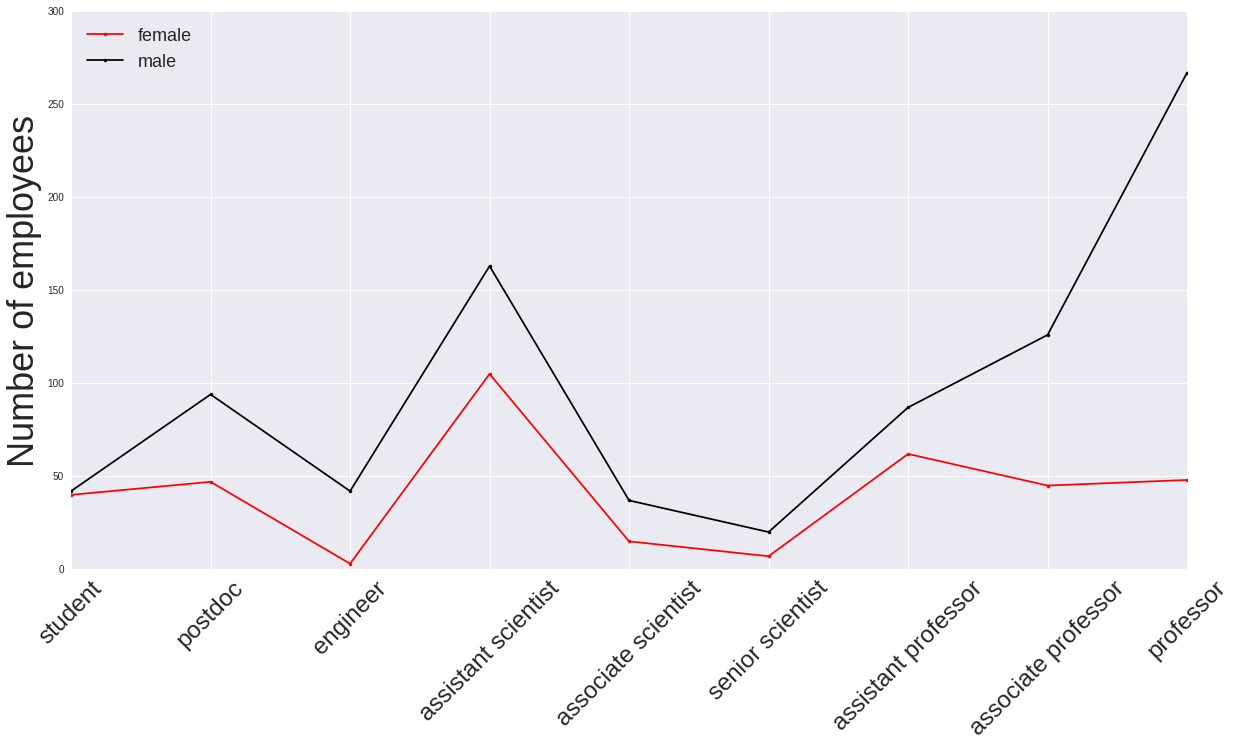
Number of employees
gender female male
Job group
assistant professor 62 87
assistant scientist 105 163
associate professor 45 126
associate scientist 15 37
engineer 3 42
postdoc 47 94
professor 48 267
senior scientist 7 20
student 40 42
Final thoughts
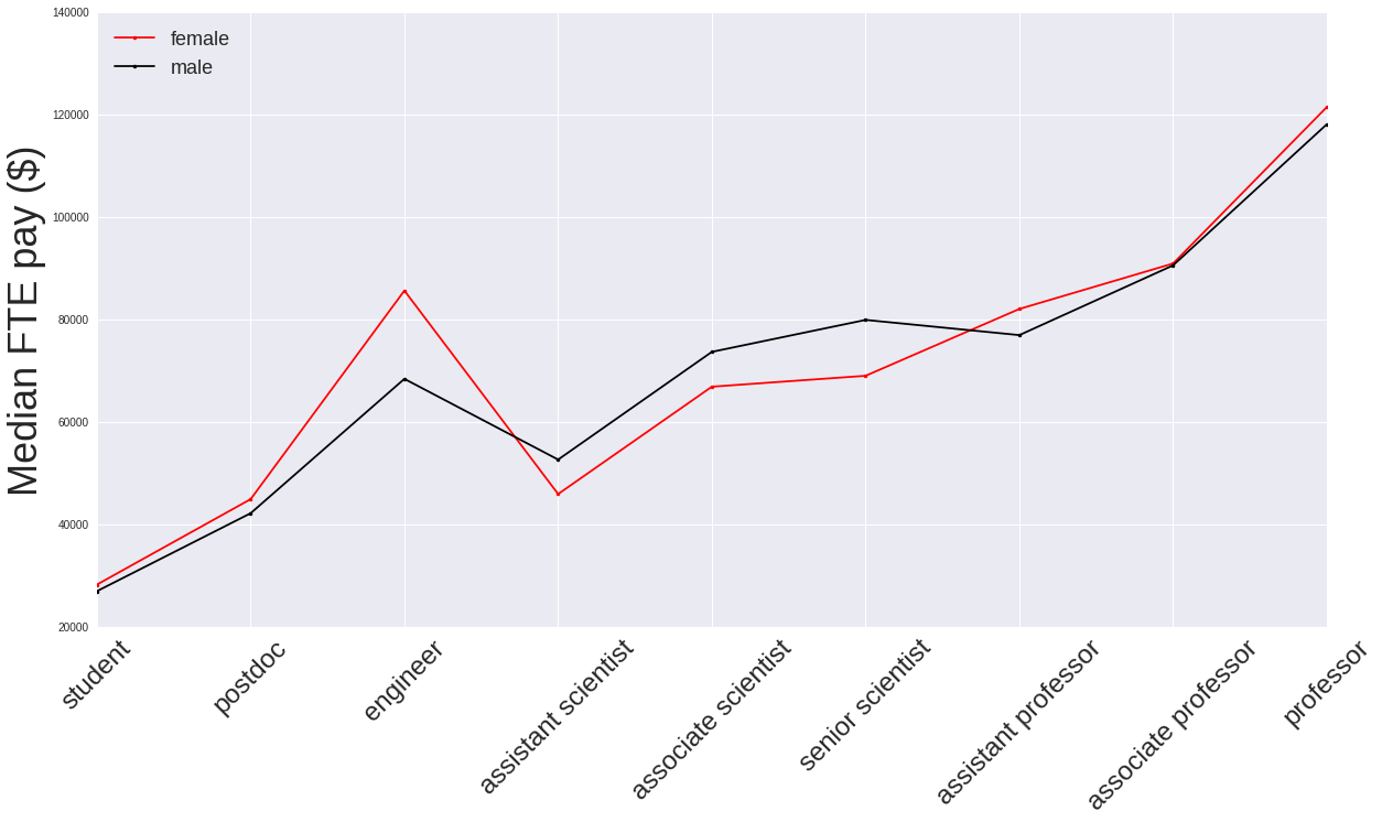
I think a major part of (though unlikely all) the salary disparity between women and men arises because there are just so many more men than women in the most senior academic positions (assistant professor and upwards), and these are the ones that are generally paid the highest wages. It might be worth repeating this analysis for the Natural Sciences and Professional department types alone to see if this trend remains.
In light of the above point it is worth pointing out the salary distribution of the “assistant professor” job type. The distribution for the women has a much larger range of higher salary values for its upper quartile compared to the men’s distribution. The origin of this could be the hire date of the female assistant professors. A hypothesis associated with this would be that salary raises for existing employees tend to be small, but salary offers (to be competative with offers from other institutions) for new faculty tend to track more current (higher) salary rates. Then if there are fractionally more women than men hired more recently they may tend to command higher salaries. If there were hire dates associated with this data, perhaps this hypothesis could be tested: how does annual salary track with hire date within the same job category?
To make more robust conclusions on the origin of the salary disparity between women and men I would need to analyse more salary data that goes back over multiple years, to track how the fraction of female to male employees and median salary evolves (if it does). Analysing this data in a time dependent way would show if in the future we expect more equitable employment between men and women, and how we expect their salaries to grow with respect to one another.
The main problem with doing this study on this dataset is it’s relatively small size. With a maximum of only a few hundred employees per STEM department type, and less than a hundred per job type, few major conclusions can be drawn overall. The main takeaway is that the University of Arizona’s salary and employment for women in STEM fits with what has been shown by other (larger and better) studies.